A colour palette can look beautiful on Pinterest and still be surprisingly difficult to turn into handmade clothes.
That is because a wearable colour palette is not just a group of colours that look good together. It needs to suit the person, the purpose of the garment, the fabric you choose, and the clothes already hanging in his wardrobe.
This matters even more when you are sewing for someone else. You are not just choosing colours you like. You are making decisions for a garment he needs to feel comfortable in.
When the colours are wrong, the problem can be hard to name. The sewing may be neat. The fit may be good. The fabric may be lovely.
But you know something still feels off. The shirt feels too bold. The robe feels too plain. The shorts do not go with anything. Your sewing is thoughtful, but not quite him.
Most of the time, the issue is not your sewing skill. It is the colour decision that happened before the fabric was cut. I see so many beautiful garments made but the fabric just isn’t right.
In this blog, I will look at five common colour palette mistakes that can make handmade clothes harder to wear, and what to do instead.

Table of contents
- Mistake 1: Ignoring the Purpose of the Garment
- Mistake 2: Choosing Colours You Like, Not Colours He Wears
- Mistake 3: Using Too Many Colours or Not Enough
- Mistake 4: Using the Wrong Proportion of Each Colour
- Mistake 5: Choosing Fabric Before Testing the Palette Against His Wardrobe
- FAQs About Choosing Colour Palettes for Handmade Clothes
-
Final Thought: Choose the Colour Before You Choose the Fabric
Mistake 1: Ignoring the Purpose of the Garment
A colour palette needs to suit the garment you are making, not just look good as a group of colours.
This is one of the easiest mistakes to make because colour palettes are often chosen in isolation. You might find a beautiful combination of colours and think, “Yes, that works.” But works for what?
This is a highly saved colour combination I created on Pinterest:

But this one shows you how a good colour combination can be used in practice.


A colour combination that looks lovely for a summer holiday may not feel right for work, weekends, sleepwear or a family event. The purpose of the garment matters.
Before you choose fabric, pause and ask where this garment will be worn.
Is it for everyday wear? A holiday? A gift? A special occasion? Something relaxed for home? Something smart enough to wear out? Is it for summer, winter or a season in between?
The colour decision becomes easier when you know the job of the garment.
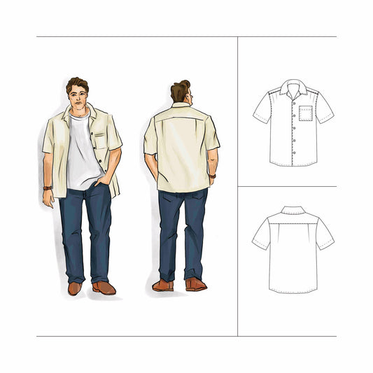
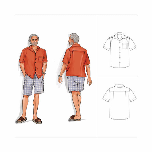
A camp collar shirt, for example, is usually relaxed and easy to wear, but it can still go in different directions. It might be a summer holiday shirt, a Christmas Day shirt, or a shirt for a beach wedding. Each purpose could lead you to a different colour palette.
If you ignore the purpose of the garment, you can end up with something that is well made but difficult to place in his life. It may be too dressy for home, too casual for the event, too bold for everyday wear, or too plain for the moment you had in mind.
When the purpose is clear, the colour palette has a direction. You are no longer choosing colours because they are beautiful. You are choosing colours because they help the garment do its job.
If you are not sure where to start, a mood-board is a practical first step. It helps you gather the colours, fabrics, outfits, occasions and style references before you commit to a fabric choice.
You can use a mood-board for a whole wardrobe, but it is just as useful for one garment. Before sewing a shirt, robe, pair of shorts or jacket, it can help you answer the most important question: what does this garment need to feel like when he wears it?
My How to Create a Capsule Wardrobe Moodboard guide is designed to help you make those decisions before you buy fabric or cut into anything.
It is a 10 step framework you can use over and over.

Mistake 2: Choosing Colours You Like, Not Colours He Wears
It is easy to choose fabric colours because you love them.
You are the one looking through the fabric. You are the one imagining the finished garment. You are the one spending the time, money and effort to sew it. So of course your own taste becomes part of the decision.
But when you are sewing for someone else, the colours need to feel like him.
This is where, I believe, your colour decisions can become tricky. A colour might be beautiful. It might suit the season. It might look good in the fabric collection. It might even be a colour you wish he wore. But if it does not feel natural to him, the finished garment can become harder to wear.
What I mean by ‘feel natural to him’ is:
- the colours enhance his features
- they match his personality
Sometimes the mistake is choosing colours that are too far away from what he already owns. Sometimes it is choosing colours that suit your personal style more than his. Sometimes it is choosing fabric because it feels fun to sew, without asking whether it feels easy for him to put on.
This does not mean you have to make everything in navy, hue grey or beige.
It means you need to notice the colours he already trusts.
Look at the clothes he reaches for most often.
- What colours are repeated in his shirts, shorts, trousers, jackets, shoes and accessories?
- Are they mostly warm or cool?
- Light or dark?
- Does he wear contrast, or does he prefer softer combinations?
Also pay attention to what he avoids. If he never wears bright colours or pattern, a bright shirt will feel too much, even if the colours technically suit him.
The goal is not to remove creativity. The goal is to make creative choices that still feel connected to the person wearing the garment.
A good place to start is in his cupboard.
- Pick the one colour that you know looks great on him.
- Then do the Fabric Formula to understand which colours to build around it. It gives you 30+ colours to build good colour combinations.
- It also shows you how to make those combinations that you will use over and again.
When the colours feel like him, the garment is easier to reach for. And that is very satisfying when you have spent hours thoughtfully making it. It belongs with the clothes he already owns and the way he already dresses.
If you are not sure which colours suit him, or you feel like you are guessing every time you choose fabric, the Fabric Formula is designed to help you understand his colour type before you buy fabric.

Mistake 3: Using Too Many Colours or Not Enough
A colour palette can become harder to use when it has too many colours. But it can also become difficult when it does not have enough.
Too many colours can make the fabric decision feel overwhelming. You may find yourself looking at a print and thinking, “It has some of the colours, so it must work.” But if the palette is too broad, almost anything can seem to fit. That does not always lead to a garment that feels considered.
When there are too many colours, the final garment can feel busy before you even think about the print, scale or garment style. This is especially true in larger garments like shirts, robes, jackets or trousers, where the fabric covers more of the body.
Not enough colours can create a different problem.
If your palette only has two or three colours, it might feel simple at first, but it can quickly become limiting and uninteresting. You may not have enough contrast. You may not have a useful neutral. You may not have a light or dark option. This can make it harder to choose fabric, trim, buttons, thread and pieces that work together across a wardrobe.
A small palette can work beautifully, but it needs enough range to do its job.
That is why I like working with five colours.
Five colours gives you enough choice without opening the door to every colour in the fabric shop. It lets you build a palette with a bold colour, a complementary colour, a neutral, a light and a dark.
Each colour has a role.
This helps you make faster decisions because you are not starting from scratch every time. You have a clear group of colours to work within, but there is still room for creativity, personality and different garment types.
For example, a summer shirt might use the light colour as the main fabric colour, with the bold colour appearing sparingly in the print.
The same five-colour palette can be used in different ways depending on the garment.
When your palette has enough structure and enough variety, it becomes much easier to choose fabric confidently.
The 5 Colour Method is designed for this. It helps you turn a group of colours into a practical palette you can use for sewing, fabric choices, wardrobe planning and all your handmade gifts.
Mistake 4: Using the Wrong Proportion of Each Colour
Even when the colours are right, the garment can feel wrong if the colours are used in the wrong amounts.

This links back to the purpose of the garment. Before you decide how much of each colour to use, you need to know what the garment is for.
- Summer BBQ
- Garden wedding
- Job interview in a warm climate
The same palette can create a completely different feeling depending on the proportions.
It is not only about which colours you choose. It is also about how much of each colour you use.
This is why I like the 60-30-10 rule. You use one colour for around 60% of the outfit, a second colour for around 30%, and an accent colour for around 10%. You can also adapt this to 60-30-5-5 if you are working with a five-colour palette.
It gives your colours a job.
One colour leads. One colour supports. A smaller amount of colour adds interest, contrast or personality.
This helps stop every colour from competing for attention. Instead you are using every colour with intension.
This is also where the idea of Charisma Colours becomes useful. In my Charisma Colours blog, I talk about choosing colour combinations based on the feeling you want to create, such as warmth or competence / authority or approachability. The balance of the colours matters because different proportions create a different impression.
For example, a bold colour used in a small amount can feel confident and interesting. The same bold colour used across most of the garment may feel more assertive, extrovert and gregarious. A dark colour used as a small contrast can add strength. Used as the main colour, it may feel more serious.
Neither choice is wrong. The question is whether the proportion suits the garment, the person and the purpose.
This is especially important when sewing for men because many men are more comfortable with colour in smaller amounts before they are comfortable wearing it as the main feature. A colour he likes in a stripe, pocket square, collar detail or small-scale print may feel too much across an entire shirt.
Before you choose fabric, ask what the garment needs to project. Does it need to look approachable? Knowledgeable? Assertive? Friendly? Or Fun?
Once you know the purpose, you can decide which colour should take up the most space and which colours should play a smaller role.
When the proportion is right, the garment feels balanced and purposeful. The colours support the intension.
The goal is not to avoid bold colour. The goal is to use colour in a way that gives the garment the feeling you want it to have.
Mistake 5: Choosing Fabric Before Testing the Palette Against His Wardrobe
The final mistake is falling in love with a fabric before checking whether it works with anything he already owns.
This is easy to do. Fabric is emotional. You see a print, the colours are beautiful, and you can immediately imagine the finished garment. But a garment does not live on the fabric shelf. It has to live in his wardrobe.
This is where a good colour palette needs to do more than look appealing. It needs to connect.
Before you buy fabric, compare the colours to the clothes he already wears.
TOP TIP: Take a picture of his wardrobe before you go shopping!
When you are in the fabric store, look at his shorts, trousers, jackets, shoes and accessories and ask yourself…”Does the fabric work with them, or will the finished garment need a whole new outfit around it?”
A shirt is a good example. You may find a print that looks lovely on its own, but if it does not work with his existing shorts or trousers, it becomes much harder to wear. The sewing can be beautiful, the fit can be right, and the fabric can still feel disconnected from his wardrobe.
This is how handmade clothes become difficult to style.
The test does not need to be complicated. Choose at least three things he already owns and check whether the fabric works with them. If it does, the finished garment has somewhere to go. If it does not, pause before buying.
This does not mean every handmade garment has to be plain or predictable. It means the fabric needs a relationship with what is already there.
This makes your sewing environmentally and emotionally sustainable.
When you test the palette against his wardrobe first, you make the finished garment easier to wear before you have even cut the fabric.
That is the real value of a colour palette. It is not just there to help you choose beautiful colours. It is there to help you make better decisions, so the finished garment feels like it belongs.
If you are trying to make more pieces that work together, my guide on how to build a cohesive men’s capsule wardrobe is a helpful next read.
And when you are ready to choose fabric, you can browse fabric collections for men with his wardrobe in mind.

FAQs About Choosing Colour Palettes for Handmade Clothes
How many colours should a sewing colour palette have?
A sewing colour palette works well when it has enough colours to create variety, but not so many that decisions become confusing. Five colours is a practical number because it allows you to include a bold colour to create interest, a complementary colour to your bold to create contrast and a neutral, a light and a dark for balance and harmony. You can buy the 5 Colour Method here.
Why does a colour palette look good on Pinterest but not work for clothing?
A colour palette can look good on Pinterest because the colours sit well together on a screen. For clothing, the colours also need to suit the person, the garment, the fabric, the occasion and the clothes already in the wardrobe.
What is the 60-30-10 rule in clothing?
The 60-30-10 rule is a simple way to balance colour in an outfit. One colour is used for about 60% of the outfit, a second colour for about 30%, and an accent colour for about 10%. It helps give each colour a clear role.
How do I choose fabric colours for someone else?
Start with the colours they already wear. Look at their favourite shirts, trousers, shorts, jackets, shoes and accessories. Then choose fabric colours that align with their Colour Type, match their personality and work with the clothes they already own.
Should handmade clothes match the rest of his wardrobe?
Handmade clothes do not need to match everything, but they should connect to the rest of his wardrobe. The easiest way to check is to compare the fabric with at least three things he already owns before you buy it or cut into it. This makes your sewing more rewarding and more sustainable because it gets worn.
What is the biggest colour mistake when sewing for men?
One of the biggest colour mistakes when sewing for men is choosing colours based only on what you like, rather than what he wears. The colours need to suit him, feel natural to his style and work with the purpose of the garment.
Final Thought: Choose the Colour Before You Choose the Fabric
A colour palette should make sewing decisions easier. It should help you choose fabric with more confidence, understand what will suit him, and make garments that feel connected to his real life.
When you have considered:
- the purpose of the garment
- the colours he wears
- the number of colours you are working with
- the proportion of each colour
- and how the fabric connects to his wardrobe
the decision becomes clear and simple.
You are no longer choosing fabric because it is beautiful on the bolt.
You are choosing fabric because it has a job to do.
Ready to start - What next?
- If you know which colours suit him but need help combining them, start with the 5 Colour Method.
- If you are not sure which colours suit him yet, start with the Fabric Formula.
- If you want to clarify the purpose, mood and style before you choose fabric, start with How to Create a Capsule Wardrobe Moodboard. (I provide finished examples here)
- If you are ready to browse fabric with a clearer plan, explore my Fabric Collections for Men.
- And if you are planning to sew a shirt, the Camp Collar Shirt Style Guide will help you think through the style, fabric and finishing details before you begin.
Written by Jane Harbison, sewing pattern and fabric designer specialising in boys' and men's clothing, colour tools and wearable handmade gifts.